Overview
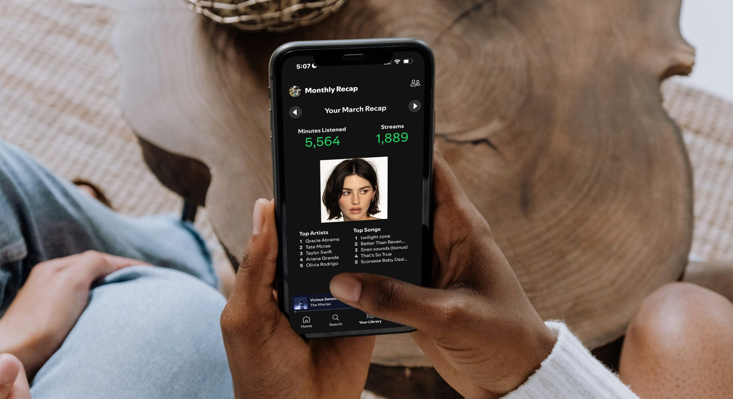
With ten weeks and a group of three, we were given the challenge to redesign a complete flow of Spotify that addresses the issues we discovered through our user research. We recognized that users wanted Spotify to feel more social and have a sense of community among friends. Inspired by tools like Airbuds and Receiptify, we created a built-in, shareable Monthly Recap feature that highlights users’ listening statistics.
Storyboarding
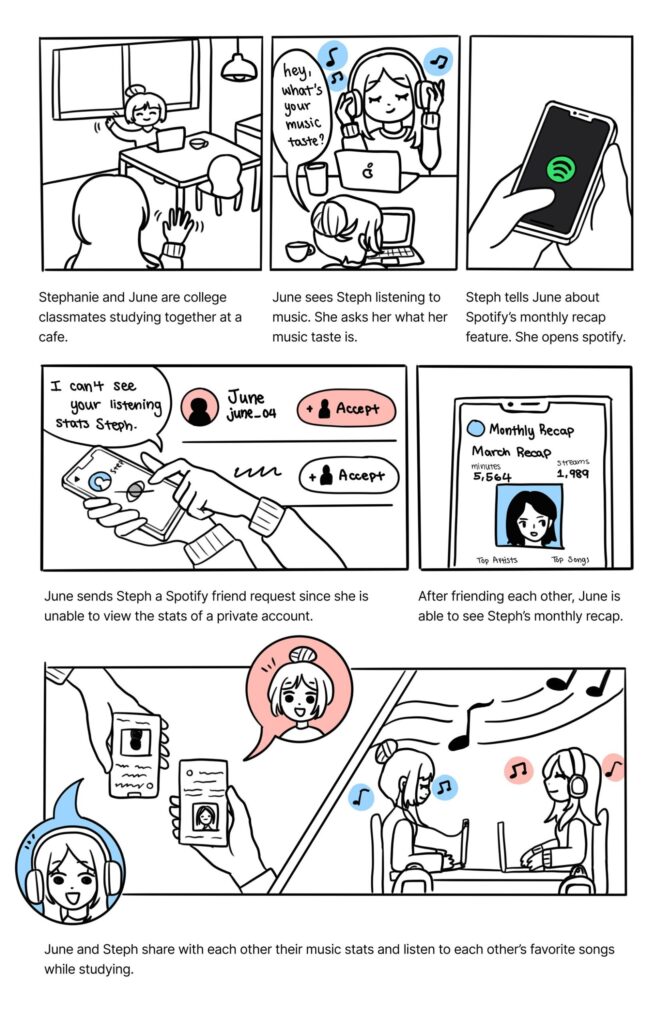
After conducting user research through a survey, we identified a need to make Spotify more social and to introduce a Monthly Recap feature. To visualize these new features, we created two storyboards.
The first storyboard is scenario-driven, highlighting key moments in the user’s experience. It explores the emotional journey of the user and illustrates the overall interaction between the user and the system. The main goal of this scenario storyboard is to convey the emotional impact of our solution.
The second storyboard is technical and focuses on the specific interactions needed to complete the scenario. It showcases the key features of the experience by highlighting essential screens as well as the required inputs and outputs.
UX Mapping
We further developed our experience by mapping out the detailed steps involved. We created empathy and user journey maps for our main scenarios. Additionally, we highlighted the primary workflow and specific user interface steps of our redesign, providing greater detail on how an individual might interact with the system.
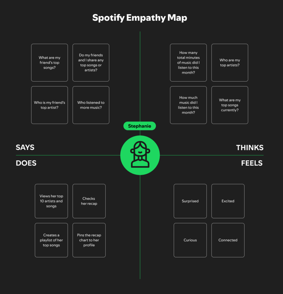
An empathy map is a text-based visualization designed to articulate our understanding of a specific user type. This tool helps teams capture and document their insights about potential product users, which is valuable for fostering a shared sense of user needs and informing feature decisions.
A user journey map is a visual representation of the process that a person goes through to accomplish their real-world goals with your product or service. It’s an important step for a deeper understanding and addressing of customer needs and potential pain points. This is a great tool to use for developing scenarios from your storyboards with more details, ultimately keeping your process user-centered as you progress with your iterations and prototyping.
Final Redesign


Video of Flow
Link to the prototype if you want to test it yourself!
What I learned…
In this course, I learned the core principles and methods of interaction design by redesigning an existing app. Through a mix of lectures, hands-on studio work, and critique, I developed a stronger understanding of how to create user-centered digital experiences. I became familiar with key concepts such as navigation, layout, information architecture, and user flows, and learned how to apply them through tools like wire framing and prototyping. Working through the whole design process, from research and competitive analysis to interactive prototyping, helped me see how each step builds toward a more thoughtful and usable interface. I also improved my ability to give and receive feedback, which was essential in refining our work. Overall, this class provided me with a clearer understanding of what good interaction design entails and helped me reflect on the types of design problems I am most interested in solving.